
The Farm: A branding Concept
Product: The Farm Logo
Role: Branding & Graphic Design

Overview
The Farm was a self-initiated branding project created to hone my design skills and explore a bold, playful aesthetic within an agricultural setting. Inspired by the charm of U-pick berry farms and roadside produce stands, I developed a logo and supporting brand elements that would bring personality, clarity, and cohesion to a working farm property. This was an opportunity to experiment with character-driven design and wayfinding across multiple brand touchpoints.

Goals & Creative Direction
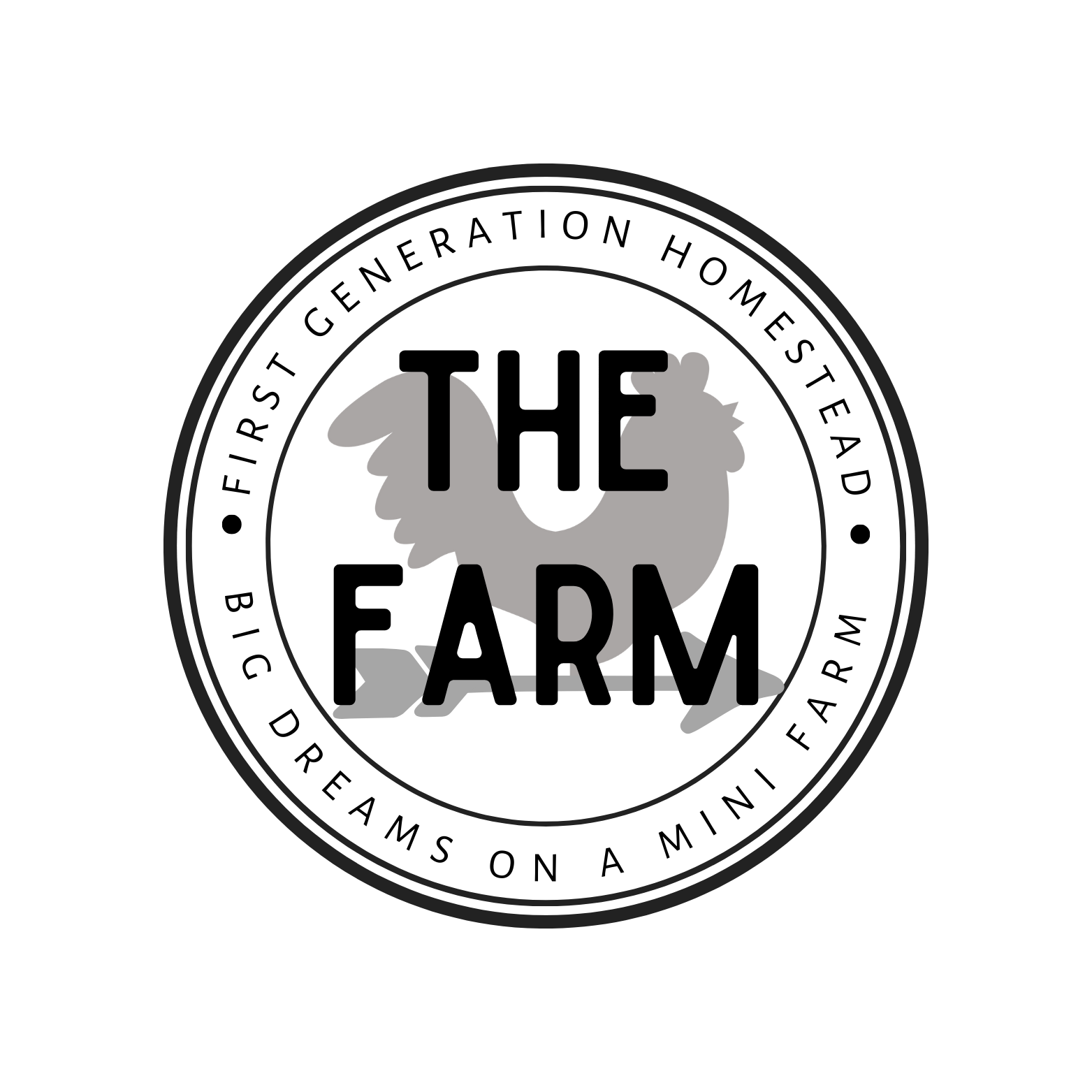
The goal was to craft a visual identity that felt instantly recognizable, rustic yet modern, and could scale easily across signage, packaging, merch, and market displays. I imagined The Farm as a family-friendly destination—a place that invites repeat visitors through charm and clarity. To capture that spirit, I leaned into the timeless silhouette of a rooster on a weathervane, a classic rural icon reimagined in high-contrast black-and-white for visual punch.


Design Process
I began with sketch exploration, testing animal shapes and layout compositions that felt bold but approachable. The final mark features a stylized rooster perched atop a traditional weathervane—an instantly readable image that doubles as a directional element, reinforcing the logo’s potential as a wayfinding system.
The stark black-on-white palette gives the brand high visibility and makes it easy to apply across wood signage, chalkboard menus, produce tags, t-shirts, and tote bags. I expanded the identity into a suite of branded elements—each simple, farm-friendly, and cohesive. These included directional signs, market stall banners, and badge-style icons that could mark areas of the property like berry fields, flower rows, or picnic zones.
Concept Outcome
Though speculative, this project demonstrates how thoughtful design can enhance both branding and logistics for physical environments. The logo system is adaptable, highly legible, and packed with character—ideally suited for a farm that wants to stand out in a busy roadside or market environment. It speaks directly to families, food lovers, and nostalgia seekers who value local experiences and handmade charm.


Reflection
This project reminded me of the joy in designing something tactile and place-based. I loved imagining how a strong identity system could shape the physical experience of a space—from how visitors find their way to how they remember it. It was also a valuable exercise in simplifying form for impact, and I’d love to bring this style of storytelling into future experiential branding projects.