Product: Drip Honey sweetened soda
Role: Brand Naming, Brand Design, Packaging Design
Duration: 2022
Overview
Tree City Bee Co. partnered with me to develop the brand identity and packaging for their honey-sweetened soda line, Drip—a refreshingly bold beverage crafted with clean ingredients and local honey. I led the creative direction from naming to logo development to full can design, aligning every element to appeal to a health-conscious but design-savvy market. The result was a visual identity that stood out on shelves and quickly became a favorite at markets.
Goals & Challenges
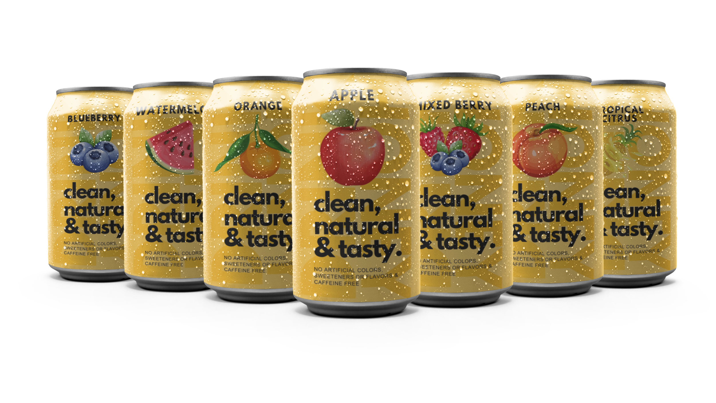
The primary goal was to create a soda brand that felt fresh, natural, and just a bit cheeky—something that would grab attention while remaining clean and approachable. The client wanted the branding to complement Tree City Bee Co.’s existing identity but also feel like its own thing. The challenge was to merge the essence of a traditional honey product with the boldness of a modern beverage, all while complying with packaging and nutritional labeling regulations.
Naming & Concept
Through a collaborative brainstorm with the founders, we arrived at the name Drip—a playful, single-syllable word that felt memorable, slightly edgy, and perfectly aligned with the idea of sweet honey dripping from the source. Once the name was set, I envisioned a logo featuring lips dripping with honey—instantly visual, slightly indulgent, and full of personality.
Design Process
I developed the full can layout with clear visual hierarchy and strategic use of space to meet FDA labeling guidelines. The lips-and-drip icon became the heart of the identity, framed by bold yet minimal typography. I chose a warm, golden yellow as the brand’s signature color, echoing the honey content while also visually linking the product to Tree City Bee Co.'s existing palette. This continuity helped ensure cohesion when both products appear together at events or on shelves.

Outcome
Drip launched to an enthusiastic reception and has quickly become one of Tree City Bee Co.’s most recognizable products. Customers are drawn to the playful yet polished design, and the can’s bold shelf presence has made it a standout at farmers markets and retail displays alike. The lips-dripping-with-honey logo has become a memorable mark that instantly connects the product to both indulgence and natural sweetness.

Reflection
This project was a study in balance: bold but clean, fun but trustworthy, natural but modern. It also demonstrated the power of collaboration and intentional visual storytelling in building a new product brand. From concept to can, Drip is a design I’m proud of—and one that continues to deliver both aesthetic and commercial results.