Product: Beespoke Responsive E-Commerce Website
Role: Product Designer
Duration: July-August 2025
Product Description
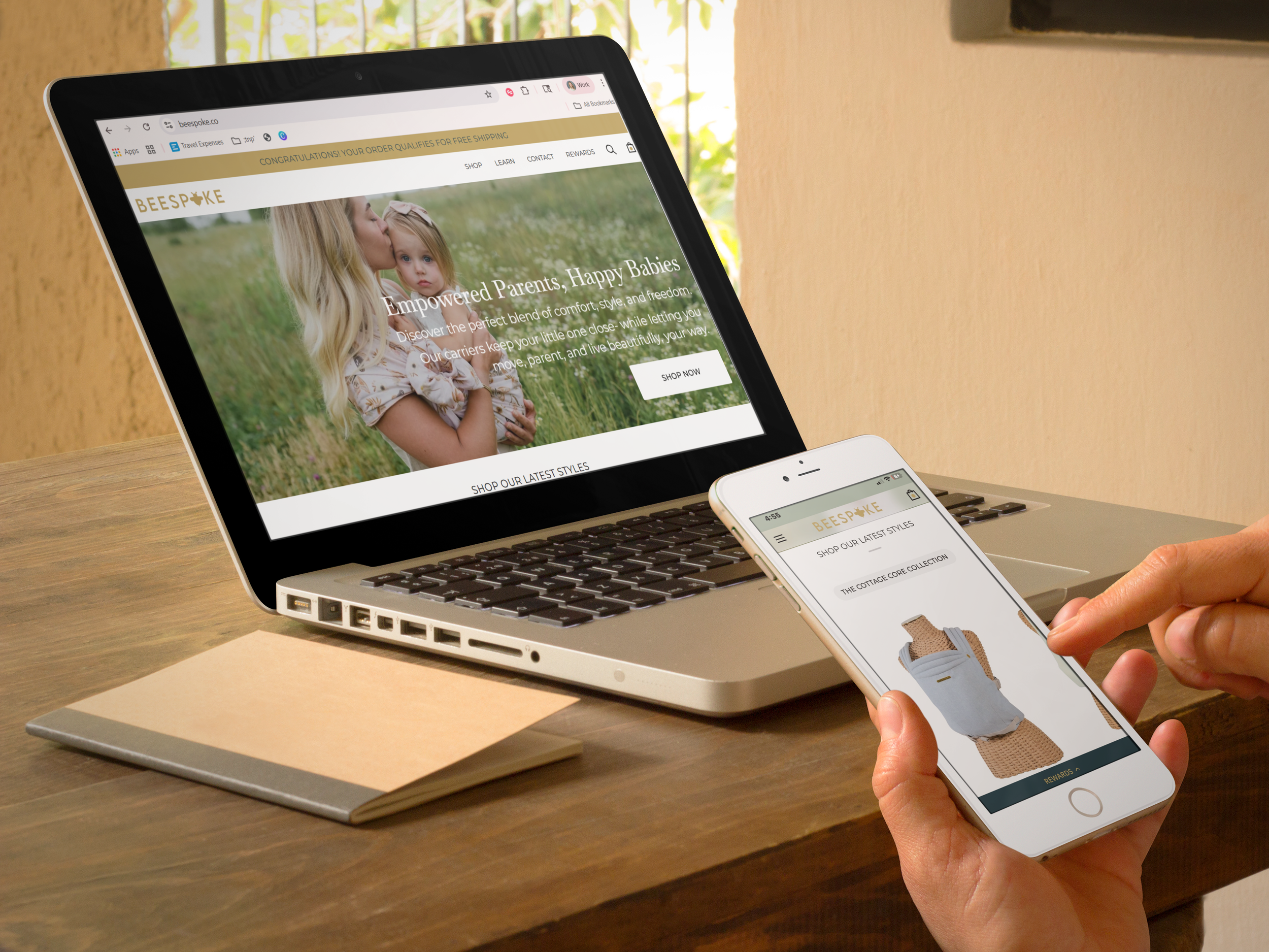
Beespoke is an elevated baby carrier brand designed to empower parents while keeping style and comfort at the forefront. The responsive e-commerce website serves as the brand’s digital storefront, showcasing Beespoke’s product collections, guiding parents through carrier education, and providing a seamless shopping experience across devices.
The Problem
As a new brand entering the highly competitive baby gear market, Beespoke needed a website that not only sold products but also established trust and communicated its unique value. Many parents shopping for carriers feel overwhelmed by technical jargon, safety concerns, and cluttered shopping experiences. Without a thoughtful, mobile-friendly site, Beespoke risked losing potential customers who needed reassurance, clarity, and inspiration before making a purchase.
My Goal
My goal was to design a responsive e-commerce website that balanced education with conversion. The site needed to:
Clearly communicate Beespoke’s brand identity and elevated positioning.
Provide parents with confidence through accessible product information, usage guidance, and safety details.
Deliver a seamless and enjoyable shopping experience across desktop and mobile.
Inspire connection through storytelling, photography, and an approachable but empowering brand voice.
Empathy: Identifying the user & Their Pain Points
Overwhelming or unclear product information
Many users struggle to quickly understand which carrier is best for their baby’s age, size, or stage.
Long paragraphs or technical jargon make it hard for sleep-deprived parents and gift-givers to confidently choose.
Cumbersome mobile shopping experience
Parents shopping during feedings need fast, intuitive navigation and checkout.
Slow-loading pages, unclear buttons, or excessive steps create friction and may lead to abandoned carts.
Difficulty visualizing style and function together
Style-conscious parents want to see carriers in lifestyle contexts and ensure they match their wardrobe and identity.
Lack of aspirational photography or visual storytelling makes it hard to connect with the product emotionally.
Gifting uncertainty
Gift-givers, like grandparents, need reassurance that the product is appropriate, safe, and high-quality.
Confusing sizing, unclear recommendations, or missing gift options create anxiety and hesitation.
Define: Objective & Problem Statements
provide a seamless, empowering, and visually engaging e-commerce experience that enables parents and gift-givers to confidently select, learn about, and purchase Beespoke baby carriers.
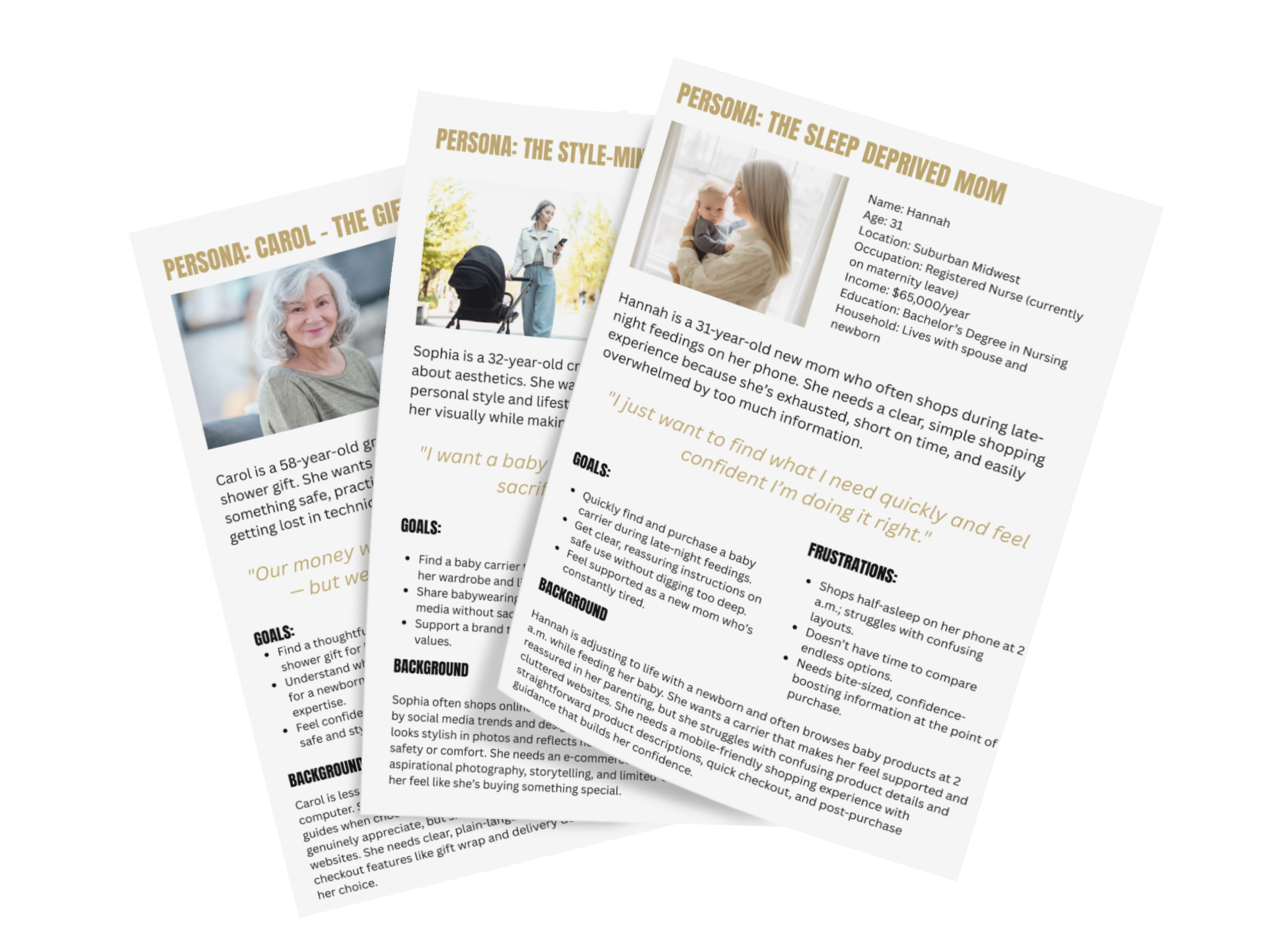
Hannah is a new parent who shops late at night on her phone and needs a fast, intuitive way to choose and purchase a baby carrier because she is sleep-deprived and easily overwhelmed by complex layouts and lengthy product information.
Sophia is a style-conscious parent who wants a carrier that reflects her aesthetic and parenting identity because she values both function and style and needs reassurance that beauty does not compromise comfort or safety.
Carol is a gift-giving grandmother who needs to confidently select a safe, appropriate, and thoughtful baby carrier because she is less tech-savvy and wants to avoid feeling overwhelmed by complex product information.
Showcase the brand’s elevated style and lifestyle appeal so parents can visualize carriers in real-life, aspirational contexts.
Simplify decision-making for tired, busy, or less tech-savvy users by presenting clear, concise, and accessible product information.
Build trust and confidence for gift-givers through clear recommendations, plain-language guidance, and thoughtful checkout options.
Deliver a mobile-first, frictionless shopping experience that accommodates late-night browsing, social media referrals, and multi-device users.

Ideate

Prototyping, Testing & Iteration
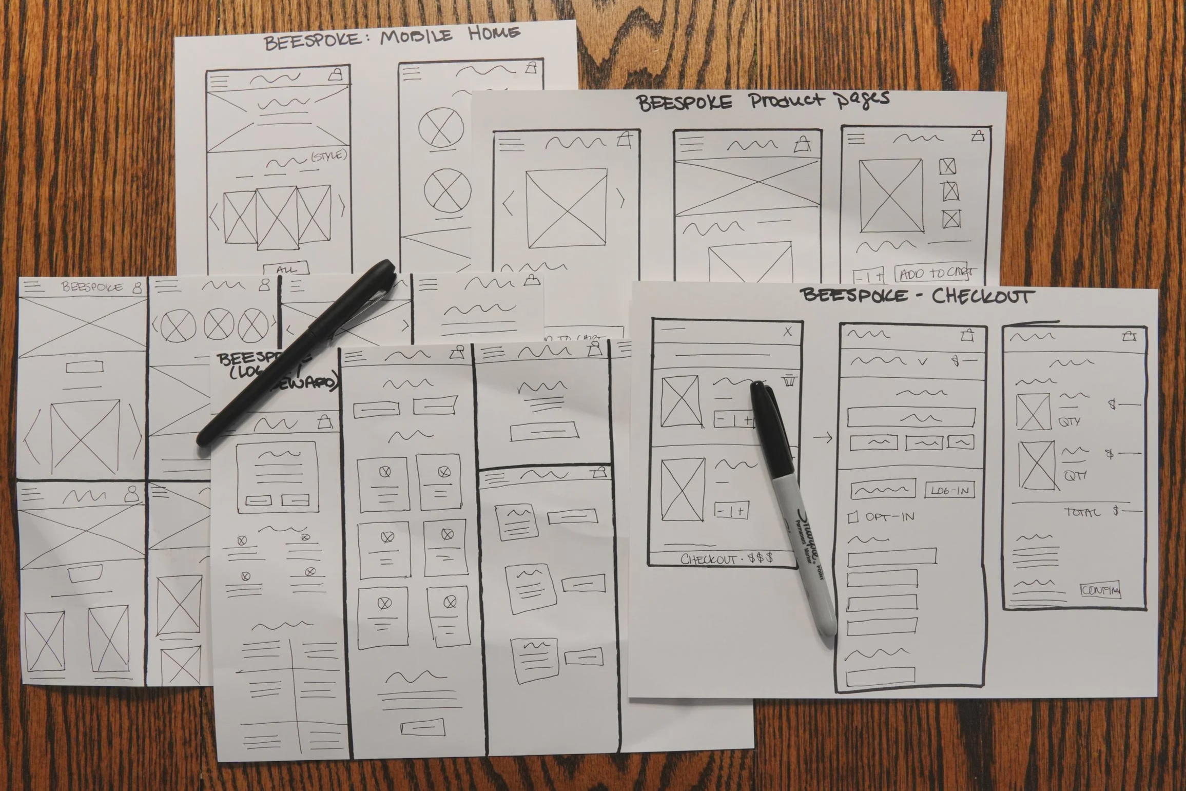
As both the designer and business owner, I knew from the outset that the final site would be built on Shopify, so I approached prototyping differently. Instead of wireframing every page in Figma, I created digital wireframes only for the main user flow—from browsing carriers to checkout. This allowed me to refine the core experience while leaving room to adapt within Shopify’s system parameters.
From there, I moved directly into high-fidelity prototyping in Shopify, where I could test designs in a live environment and ensure functionality aligned with the platform’s capabilities. This process required continuous iteration: when Shopify couldn’t support a feature exactly as I envisioned, I researched competitor websites and themes, experimented with available options, and either integrated third-party apps or adjusted the design to work within its limitations.
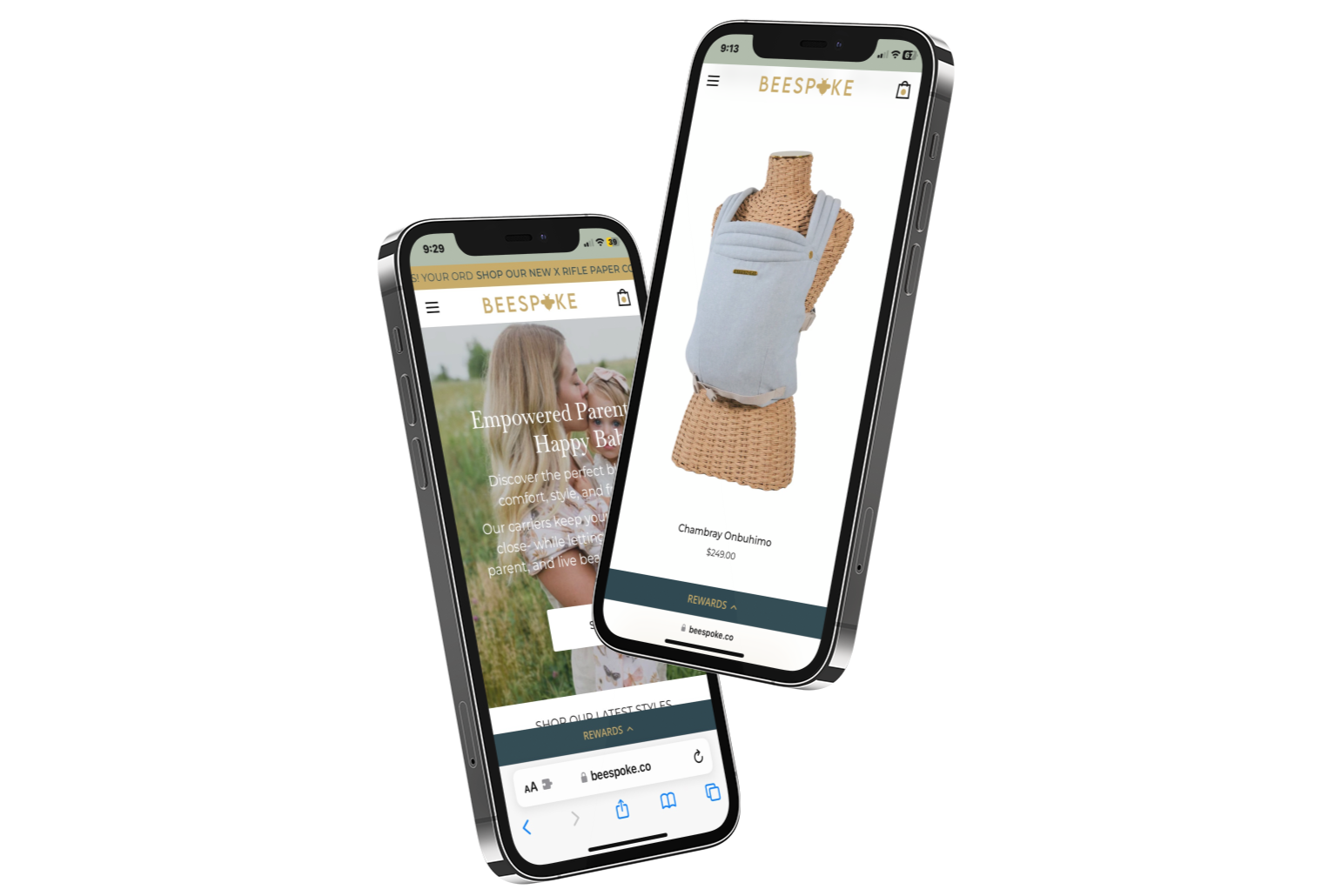
This hands-on process of building, testing, and refining has been ongoing for the past two years. By prototyping directly in Shopify, I ensured that Beespoke’s site wasn’t just a polished concept—it was a functional, scalable e-commerce platform designed with the user experience at its core.
Key Takeaways
First Product Design Experience
This project marked my first full product design experience. Building the Beespoke website allowed me to apply the design thinking process from start to finish—research, ideation, wireframing, prototyping, and testing—while seeing how each step influenced the next.
Learning by Doing
As I completed the Google UX Design Certificate alongside this project, I was able to immediately put new concepts into practice. Each phase of the course translated into real-world decisions for the website, helping me bridge theory with hands-on application.
User-Centered Perspective
Designing for Beespoke taught me to prioritize user needs over assumptions. Through user personas, journey mapping, and problem statements, I learned how to frame the design challenge around parents seeking both functionality and style in baby carriers.
Iteration is Essential & Flexibility is Key
One of the most valuable lessons was the power of iteration. Early designs gave me a foundation, but usability testing and feedback revealed new insights. Refining the layout, navigation, and brand voice made the final product more intuitive and aligned with user expectations. When Shopify’s limitations prevented an exact design, I adapted through theme research, app integrations, or design adjustments while keeping the user experience intact.
Designed for real-world use, not just theory — by prototyping directly in Shopify, I ensured that the site would both look and function as intended within the platform’s technical constraints. Rather than a static mockup, the site itself became the prototype, evolving over time into a functional e-commerce platform.